Personally, I’ve been doing a lot of work to learn NOT to judge a metaphorical “book by its cover,” but as a writer and publisher I find myself judging actual book covers all the time. I thought you might be interested in the behind-the-scenes of how the new Move Your DNA cover came to be.
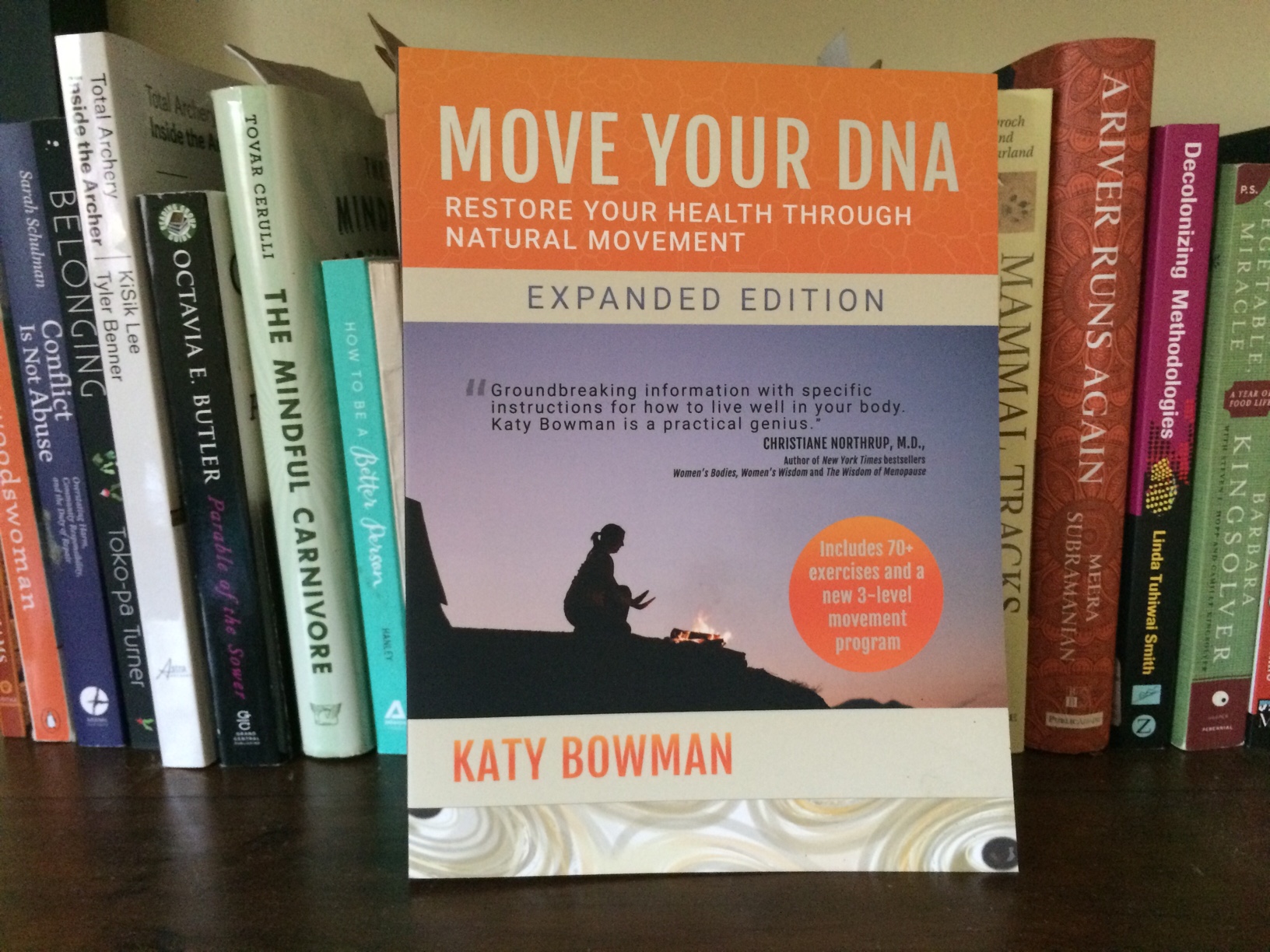
A book about movement usually has a giant physical feat on the cover. The “big idea” behind Move Your DNA is how everything we do with our body is a movement—even squatting by a campfire in nature. Move Your DNA explains how the movements going on in this fire-nature-squat scenario could not only be tremendous in volume and distribution over your body—they might also be the balance to the more narrow-range of movements found in a favorite mode of exercise (and getting them might make you feel better).

Writers get a lot of say in their covers, but not being designers, we rarely create them. And so we have to do a lot of persuasive talking (or writing) to get the cover of our dreams. It took one set of writing to get that person just “sitting” (i.e., the opposite of moving to some people) onto the cover of a movement book. I also, being a nerd, wanted a science-y element. The designer tried lots of options, but in the end my suggestion on bone cells on the bottom won out. (Move Your DNA discusses bone robusticity and how loads shape our body deeply. A lot of our skeletal shapes are due to how we’ve moved over our lifetime.)
After the success of the first edition, I decided to write an expanded version that included a few more sidebars clarifying the book’s arguments, improving the photos, and adding a movement program to increase the practicality of the book.
Here’s a little publishing “behind the scenes:” When you change a book, you have to change the cover, but we didn’t want to change it tremendously. We brightened the cover, adding orange, my favorite color. We also added EXPANDED EDITION to the front, and in doing so, we lost a little bone-cell real estate, which was fine, as probably close to nobody recognized what they were. Also, NOTE THE BADGE! Turns out we’re drawn to badges.
Flash forward four years later and Move Your DNA has been nominated for and won some awards. When a book print runs out, it needs to be printed again, and when this happens there’s an opportunity to fix any typos you’ve found since the last print and update the cover (which rarely happens).
I read an article about Big Idea books—books that introduce a new idea. Move Your DNA presents the Big Idea of movement as nutrition, exercise and movement being different, and the source of our necessary movement volume and diversity being nature. The article stated that the cover of a Big Idea book shouldn’t feature a particular person. Turns out, when we look at a cover, if the cover doesn’t look like us, we’re less likely to think the book’s content applies to us. So, we decided that for this reprint, we’d do a new text-only cover for Move Your DNA. These are covers that have little going on but text. AND BADGES, because see above. We love badges.
So here’s the new cover. My heretical picture of a “sitting” person getting a ton of movement is gone, but the now more famous title is bigger. The science element is a DNA molecule, fittingly.
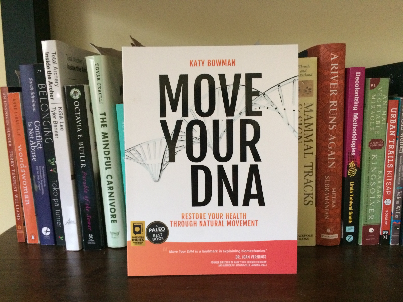
I love it (see, it’s still orange!) and I hope you do too.
Oh, also note the importance of SPINE DESIGN. Although most people buy their books online these days, you can still find books in actual bookstores, so how the spine looks on a shelf matters a lot. You can see the spine title has bumped up in size, and also my author credit appears to be getting shorter.
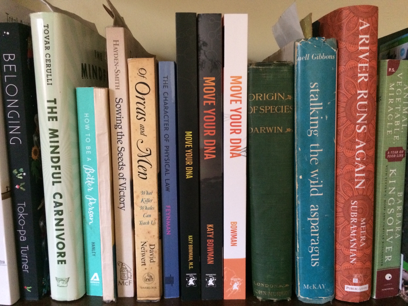
On the next edition, the spine will just read “KB” and the cover will be completely blank, like the Beatles’ White album.